
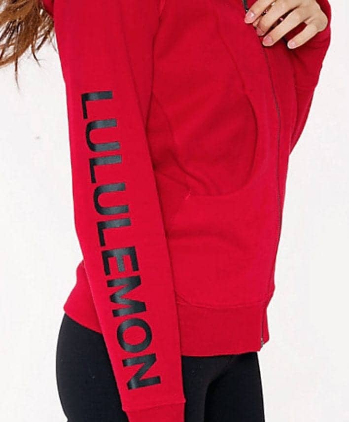
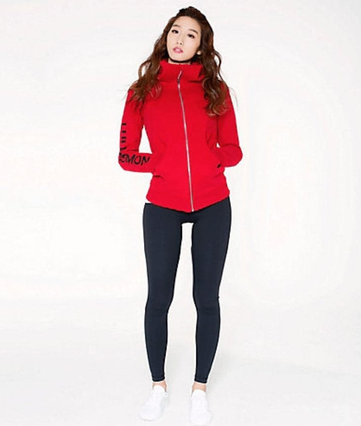
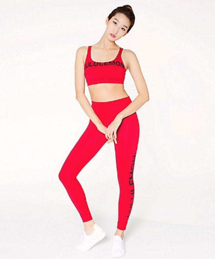
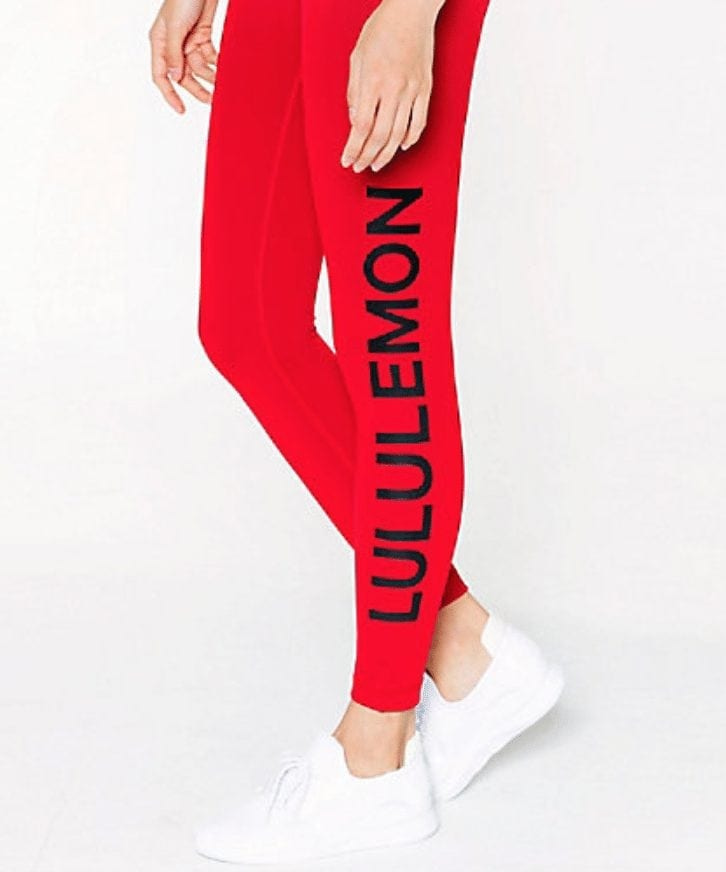
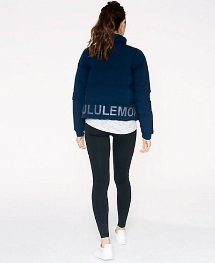
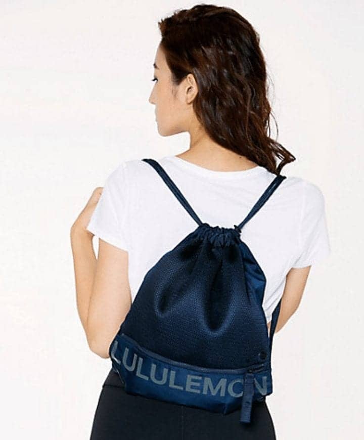
The Lululemon Asia Exclusive capsule was just released on the Hong Kong website. I love the red and the navy, but….those giant logos are so not Lululemon. Lululemon never used to chase customer trends like this and adapt themselves to whatever the market demands. Lululemon used to pioneer trends, and the customers would find the brand. I see why they made this an exclusive capsule to Asia, it’s a big new market for them, but it’s still surprising. I am not averse to logos and I don’t necessarily pick inconspicuously branded items, but I don’t gravitate to big loud logos that overtake the design. I think I also don’t like it because this big block lettering is new for Lululemon and not one I recognize as their signature Lululemon logo, brand or their type. It looks more like the Supreme branding, or Calvin Klein. It reads more as a basic universal lettering. What do you guys think? Do you like this trend? Do you like this trend on Lululemon items?
Here is an article from Vogue from 2016 about the logo trend. “Logos Are Back: How To Wear The Latest Street Style Trend”
“Likewise, the industry on the whole seems to be taking a long, hard (or, as the case may more aptly be, cheeky and exuberant) look at institutional notions of “bad taste.” Chief among those notions? Logomania’s glorious return.”
28 comments
I don’t like it. Never have. Regardless of designer. I don’t need to tell the world what brand I’m wearing. People in the know, know. If they don’t, they ask or find it. The only time I wear big lettering and announce something it’s for my college team or my pro-football team. In that case, I think there’s a shared community because you went to the school or the pro team represents the city you live in or came from. I know there’s a Lululemon community but I feel like it’s different. We all wear Lululemon for different reasons and it’s not to “cheer” on the brand. We support the brand by buying.
When I see big lettering like that I think it cheapens the value of the brand; especially when it’s marketed to be high end. That’s why I don’t like big Gucci and other luxury brand lettering. But I think it’s just the fashion trend now. I see it everywhere.
The only time I even considered buying a Lululemon Swiftly with big lettering on it was when it had Los Angeles written on the bottom of it around the side. I considered it because I love the city I live in. Then I thought the better of it and put it down. Lol. I don’t need to announce where I live.
I agree – not a fan of logos, particularly not when it comes to mall brands. The only logo stuff I’ve been wearing as part of this trend are some “vintage” Jeremy Scott x Adidas tees, and even then, that’s just the Adidas logo. The shirts are so cool the logo is almost secondary. This stuff is both bland and arbitrary – the random sans serif font in all caps in no way makes me associate these items with LLL because it’s not actually part of their overall branding. I think they must think that customer demand for true red items will outweigh the lack of desire to wear Lululemon’s name in two foot long block print…no thanks.
ooh the Jeremy Scott x Adidas tees intrigues me. I’d love to see them sometime if you ever feel like sharing. Did you buy them consignment?
I like the Lululemon (Stylised A/Omega sign). I liked that it was discreet and yes I liked it when it was on the calf area of pants.
This collection like is a bit too in your face.
The only thing I like is the Scuba III on the blue because the lululemon lettering is slightly less obvious
I’m not a fan of logos. I love my lulu because of the way it fits and performs. I am not even a fan of the small omega on the leggings and tops, I appreciate when its tone-on-tone. Way back in the day when their leggings were reversible, one side had the logo on the calf while the other had it on the back of the waistband which was so great.
I have zero desire to wear the Lululemon name on my body and I agree – this seems really arbitrary given that they don’t really have a text-based logo. This stuff is already dated because LLL is never on-trend but rather lagging behind. If anything, I assume most people would think these clothes are knockoffs because it’s so outside the norm for them.
Exactly. It’s so cheap looking, you assume it’s a knock-off.
This is why I refuse to buy Nike. I associate Nike not with elite athletes, but with fat guys wearing knock off Nike huge logo t-shirts. Very down market.
That said, this too shall probably pass. I’m pretty confident it’s just a stupid trend, not a change in direction for Lulu’s marketing.
Slight change of topic: what do you guys think of the new, red “This is Yoga” bag? I’m very happy with it. Overall, I thought the “This is Yoga” campaign was a bit idiotic, but I was not a fan of the Manifesto, so it’s nice to see it replaced by something that still feels like Lululemon.
Never,ever going to wear printed logos. I wear something because I like the style, print and or quality. A company gets my money when I buy something from them. I refuse to be a walking billboard for them.
I don’t like big lululemon signs on clothings. I won’t ever buy them. It makes them look cheap. I don’t even like the logo with white/reflective color. I prefer it the same color as the background’s.
No Logos for me. I do not care what brand i am wearing, I don’t need to advertise, the clothes should speak for themselves.
OTT, but LuluMum, i have bought a few P.E. Nation pieces from Carbon38 and they are so retro cool!! I’m obsessed. Have you bought any other leggings or pieces since you have last purchases the leggings (with stars on bottom half of leg).
I love PE Nation so much.I haven’t yet purchased again but I do have my eye on the same star tights but with the black background. I’m going to make another purchase in the spring when I know I can stop at my P.O box.
Why can’t we just have true red plain pieces? Is it so much to ask?
I’m in the minority. LOL. I love it lots! Asia market is more fashionable than North America. It makes sense that LLL launched it there. Hope we see it also in North America.
Are you 17 or something? I don’t mean that question to be a knock in anyway (I wish I were 17 lol) just curious if this appeals to a younger market maybe?
…it’s a mall brand. And trendy isn’t synonymous with fashionable. Certainly not synonymous with style.
Abercrombie and Fitch is also incredibly popular with the Asian markets and known for their logo mania. They have since (at least attempted) to change for the North American and European markets.
I’m neither attracted to, nor turned off by the logo. It really depends on the item. If I like the fit, fabric and functionality of a piece, the color/pattern is secondary. That being said, this applies to athletic wear in my wardrobe and agree with most of the other comments in reference to branding. For instance, I refuse to spend a ton of money on some coated leather/non-leather purse emblazoned with a brand’s logo to advertise for them. It’s tacky and there are so many counterfeits it really defeats the purpose. Quality speaks for itself, whether it’s a well known brand or artisanal.
If we receive this line, unless you’re a size 2 or 12, you might wait it out and see if it hits markdown. At least based on the comments and how the other logo products are selling. I managed to snag some great pieces (at least in my opinion, Box it out Tights, Full Freedom Crops) over the last month because they never gained much notice.
Totally off topic, does anyone know of any stores in Canada that still have the train times crop that were md to $39? TIA
If you want me to wear your logo and advertise for you, you should pay me. Not the other way around.
I have never liked big logos or names on clothing. Makes me think it is a knock off. I do find that some cultures do gravitate to clothing with labels as they want people to know they can afford to buy a particular brand…around here it is philipino and east indian that prefer logos…like Tommy. Ralph Lauren etc. Perhaps its not available in their countries or very expensive there. Just what i observe…
Looks like counterfeit Lululemon . I would never buy this crap. But Asians love brand name and logos. I know this from traveling all over Asia for work for many years. I find this crap tacky and cheap.
I’m not necessarily in a rush to buy because I think this trend might skew a bit young for me but I do think it’s cute.
I never minded it when they used to work in their name or logo as part of a print. And I bought a couple different colors of the burnout manifesto shirts a few years ago. But the block lettering is so in your face. It kind of feels like the person is trying too hard to say “look at me in Lululemon.” It’s not for me, but I could definitely see a much younger teen group rocking this style.
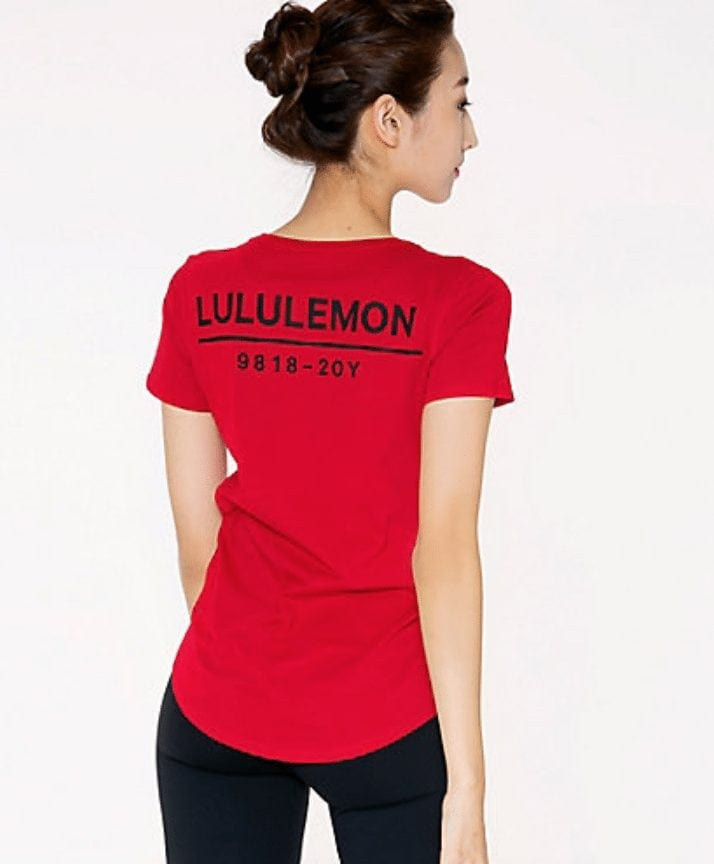
This brand name on clothing trend is just a big fat NOPE for me. Maybe if I really liked something that was cozy comfy to wear around the house but not when I am out and about do I want my clothing to scream the brand I am wearing. As for the 9818 – 20y on the back of a Love Tee I had to think about it for a second then realized this was their way of advertising their 20th anniversary and it’s not resonating with me. I expect we will see this Tee being worn by employees throughout the year. I know it’s early in the year but I sure hope LLL has more in store for us other than a 9818-20y tagline on a tee shirt. I am hoping to see the return of some classic styles, prints and colours from the past that helped to make LLL so successful. I am kind of surprised they didn’t start the year off with their signature red like you see on their bags instead of this more orange/red.
Love that “dark red” color, but can’t stand the enormous lettering.
I live in Asia and I prefer not to wear clothing that shouts the brand name.The use of large generic lettering cheapens the lululemon brand, but I think this capsule is targeted at certain Asian markets where loud lettering appeals to the consumer. The Lunar New Year is fast approaching, hence the abundance of red — it’s really a cheap marketing gimmick for product placement during the festive season.
Yes I agree that it is geared towards the Chinese new year and they love red. I am in the minority and love it! I love the red and navy and I must admit that I am asian living in Asia and considering getting the red WU.
Bold red? Yes. Massive printed brand name? Heck no. Way too loud, crass, obvious. Absolutely suited for nouveau riche Asian audiences like those in the China market, but off-brand for Lulu who never before had (and don’t need) to try so hard – quite disappointing.
Why was a 20y logo released with this? Curious !