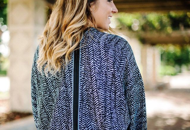
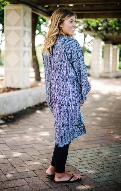
401
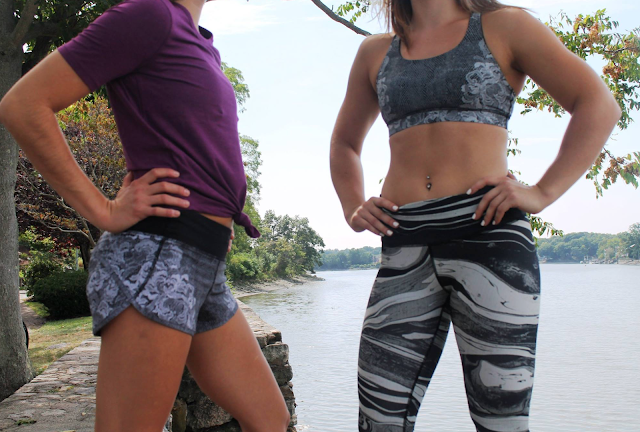
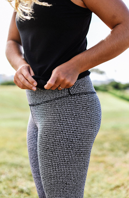
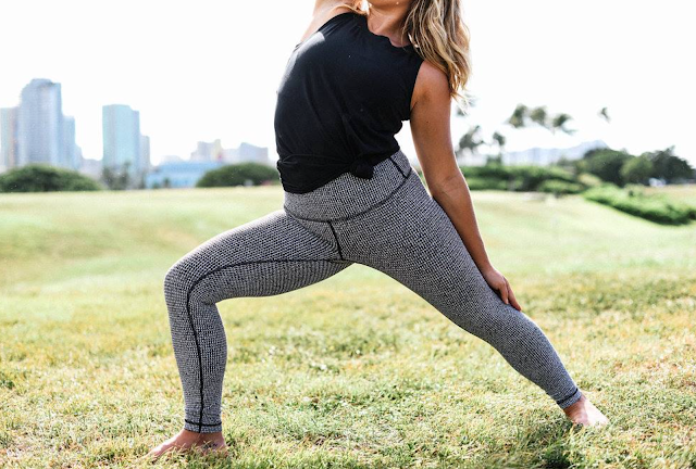
Speed Shorts/Florence Print, Energy Bra/Florence, Speed Wunder Tight/Mixed Marble


Tonic Sea Energy Bra
Love this color. It reminds me of Heathered Earl Grey.


High Times Pant/Teeny Tooth, Muscle Swing Tank


18 comments
Yes heathered Earl Grey. …that's the colour…lol with a grey cast. I put toothpaste up against it and found the colours to be close.
I posted this on LLA, but you can totally see the blue underwear on that girl in the Tonic Sea Energy bra. That's pretty bad.
can't see any underwear…
I don't either…:)
I thought I could see her underwear too, but it's hard to tell if it's the busy print doing something to my eyes. This new fabric seems very hit or miss imo.
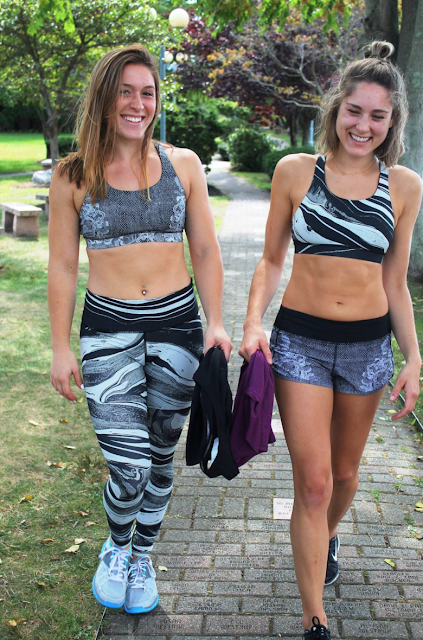
I can't see any sheerness, but maybe you have to look in person. LLA said she got good coverage in these . I like how Marbled mix looks paired with Florence print. I just don't need Speed Tights, I'm not a runner. I might consider HT
I don't think wearing the two prints together works well, too busy for my taste. Even wearing the same print top and bottom is a very busy look, I prefer a solid colour on top with these printed bottoms.
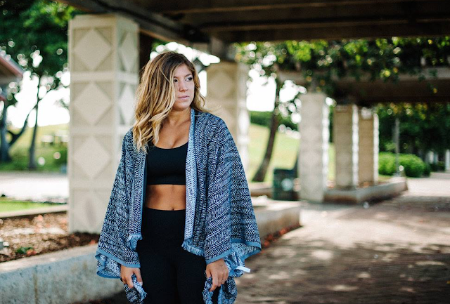
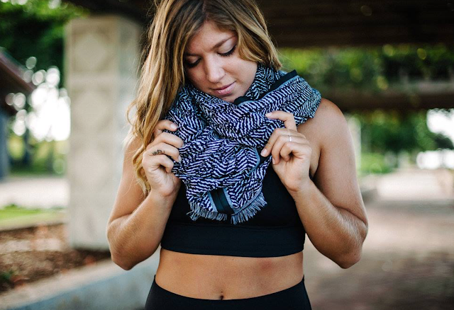
The Be Present Scarf looks really nice but that is a whole lot of fabric to drape around your neck, it must be a very thin knit.
I agree with you, I also usually wear either solids or only one piece with print. I just think this particular combo looks cool. I'm not wearing matching prints on top and bottom either , it's too matchy matchy for my taste
I got my Tonic Sea Ta Ta Tamer III today… have to say, I'm not in love with the colour. It's an ok colour, but if I had of seen it in person first I wouldn't have purchased it. Would have loved a more cheerful light green shade like Bali Breeze or Menthol. Tonic Sea is a much duller/gloomy shade of light green, which is ok and has it's place at times, I don't hate it, just not loving it. I really have to be absolutely in love with something now if I'm going to be giving Lululemon any of my money. I don't actually *need* anything anyway, so have made a point to be especially choosy with my Lulu purchases just because I'm really tired of all of this company's shenanigans (not sure if right word… but just tired of all their crap).
Also got the Chilled Grape Fly Away Tamer II Headband and compared the colour with my Regal Plum Define and the two colours are very, very close. Chilled Grape is just a little darker but very similar to Regal Plum. I would say that if you already have something in Regal Plum and thinking about Chilled Grape in a similar item, then you could probably easily pass on it.
I wonder if they are planning on discontinuing the Vinyasa Scarf… hardly any new colours lately and you would think there would be more new colours at this time of year. I'm still wishing for a white herringbone one… would also love for them to make them in jewel tone colours of coco pique.
I'd love a white herringbone one vinyasa!
Does anyone know if the black and white Be Present Scarf has been uploaded on the Canadian site? Only Magenta ones are available now. Thanks!
Thanks for letting me know!
It had been so it must have sold out. I remember seeing it and considering it.
I bought the High Times Herringbone pants and I LOVE them! SO thick and soft. Perfect for the winter, and perfect length for my 5'4" frame.
Whose genius idea was to leave the speed shorts' crotch area visually darker? We all try to avoid this look. It would be a nice lace print otherwise. I love the manifesto pinstripes though, I hope we will get jet pants or some other pants in this pattern.
The speed shorts really don't look good with the 'highlighted' crotch area. I don't know anyone who wants to highlight that area. Plus, as others have already pointed out in previous comments, it also makes it look like you peed yourself… not a good look for anyone…
The manifesto pinstripes is really cute, I like the looks of it a lot. Too bad I don't like Lululemon's manifesto though…
The mixed marble print in those pants is sort of a disaster to me. It does not make these nice athletic girls look good, what's it gonna do to me? No thanks. Not a fan of mismatched weird prints anyway.
Agree on the dark "V" section on those speeds. If the lace pattern was on the whole short I would have been all over them and they'd be sitting in my closet but alas, I don't want to draw attention to that area and it's very attention drawing so no go for me.