Cristina
Cristina founded The Sweat Edit community in 2010, from her home in Vancouver, BC. She loves working out when she’s not at work managing the website. Her favourite workouts include olympic weightlifting, crossfit, running, and spinning on her Peloton. Favourite Peloton Workouts: Power Zone Training with Denis Morton or Matt Wilpers. Read about The Sweat Edit for more.


24 comments
They can keep it. I'm not impressed.
Wow I am so excited. No really. T_T -___-x
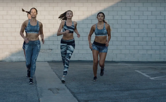
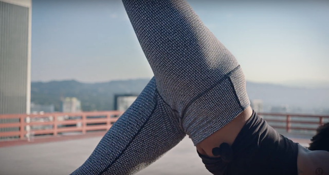
What's with all the black white and grays?? I barely buy neutrals for workout wear (Coco Pique and Herringbone are my neutrals) because I love color. I don't mind a neutral color like dusty muave or rose or quartz (why so many variations?) but black white grey is really boring. :{
I'm guessing all the black white and grays are because they can't put together a cohesive collection of coordinating items that work together. It's so much easier when it's all black white and gray, with the occasional pop of colour added in there once in a while to go with all that black white and gray.
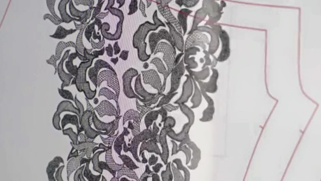
That very final image you posted looks interesting. Everything else is kinda meh.
Agree, the last black and white pattern looks promising… Let's hope they don't ruin it with peepholes.
Not for me…I've got plenty of black and white I love color and am so glad I've stocked up. Visited a store today and the wall of pants was simply black with a bit of blue…yawn. If this is a lasting trend towards boring neutrals then I'll be buying more off of eBay and other brands.
Color please?
Last print looks like the dottie tribe wup except with lace pattern ..And a coordinating bra and shorts…not sure I need these too….
Nothing interesting, looks like it's going to be a boring year for Lululemon. I don't see anything from there other than black white grey. Maybe it's time to save up my money lol?
I love black/white, but this is even too much for me. I am interested in the shorts shown, with the two different patterns. Otherwise, all of the different black/white patterns get boring. One or two is fine, but they're in the process of overkill and redundancy.
When I run, I like color (makes me more visible to cars and other people).
this!! they are doing to the black/white what they did to bordeaux drama. and we all know how that one sits with customers lol
Agree. I also think the whole showing off your bra straps thing is at the point of overkill and redundancy now. It's just getting ridiculous now, it isn't even cute anymore, just ridiculous. Now every single top and tank is designed to show off as much bra as possible and the bra designs are getting to be a strappy mess. Same thing with all the mesh, although mesh was never my thing, it seemed like a cute option at first for those who liked it, now, not so much and almost every single pair of crops or pants is loaded with mesh and it just looks trashy.
Anon 11:44am I totally agree with you.
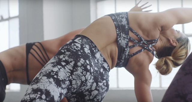
I like tie dye and #5 print. I don't mind neutrals with occasional pop of color.
The shorts could be interesting!
It seems the focus is on neutral prints for all bottoms with matching bras and some of them look nice but as we have all been saying for months now, how many black and white/grey prints do we need? I can't help but think they will be restricting their sales by offering so many similar looks. Unless all we wear on top is a matching bra our options for tops look dismal with very basic boring looking designs made from thin fabrics in black, white and grey, which is not appealing to me at all especially when they will undoubtedly be over priced.
When I look at the new tops/tanks released yesterday along with what is already on the racks, I see nothing that draws my attention design wise and nothing that impels me to want to pay what they are asking.
I LOVE black, white and gray with pops of color here and there but even this is a lot. I mean after a while they all start looking the same. That one print looks so close to the Dottie Tribe print that why would someone want both? I have the Dottie Tribes, there would be no reason for me to purchase something else so similar. I don't know…I'm all for neutrals but there needs to be some color somewhere…anywhere!
I agree with you ladies. this is just too much.
I also love black/white/gray prints. the issue is that lulu releases them back-to-back. they need to space them out and have something else (colors) in between. otherwise all these prints start to look all the same.
JUST A HEADS UP EVERYONE — LLL WEBSITE NOW SHOWS MODEL PICS INSTEAD OF FLOATING PICS. I checked for other changes like getting the name of the colour by putting the cursor on the dot but no go. Could this be the beginning of more changes to come???
Huh, no model pics on phone or computer for me.
me neither…
I just checked again and both Canadian & US websites show model pics first and when you put your curser on the pic the floater appears. I checked under various categories and they all had model pics. If only they would organize them now.
Booooooooring!
I'm interested in a couple of the prints in the tights but that's it. I'm also hoping they'll throw some color pieces in there too. And not bordeaux drama.