New Strive Multi! Strive Multi Inspire Tight and Wunder Under Pant, and Muscle Love Tank
by Cristina
written by Cristina
Cristina
Cristina founded The Sweat Edit community in 2010, from her home in Vancouver, BC. She loves working out when she’s not at work managing the website. Her favourite workouts include olympic weightlifting, crossfit, running, and spinning on her Peloton. Favourite Peloton Workouts: Power Zone Training with Denis Morton or Matt Wilpers. Read about The Sweat Edit for more.
previous post
Year In Review|Best Of Lululemon 2016
next post


35 comments
Oh…. now that I see it close up I don't think I like it. But I like that there is colour!!
Agreed. I thought it was a space theme, like the recent Ivivva capsule, but it's just splatter. I've heard it's nice in person, so I'll wait and see, but the pictures do not look promising!
Not my thing
too Ivivva like. pass for me.
Oh thank goodness I'm not the only one that thought this! It looks so Ivivva-like.
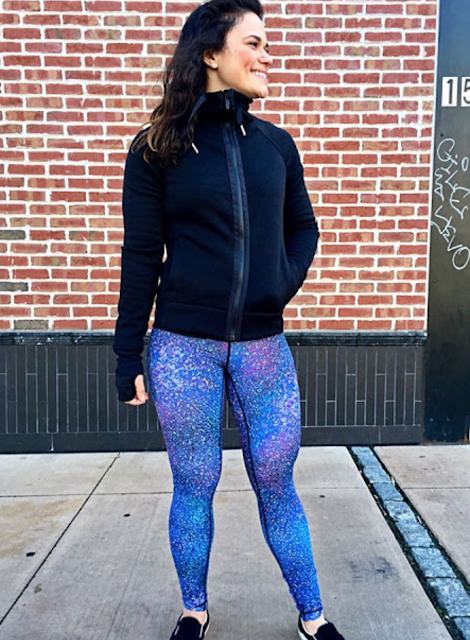
I adore it from far away. But close up just looks like paint splatter. I was hoping for a true galaxy-type print. I don't care if other labels have done something similar. I prefer the fabric of Lululemon, so I'd love if they did a real galaxy print.
Are they going for an avatar movie theme?
hahaha so true!
Horrid.
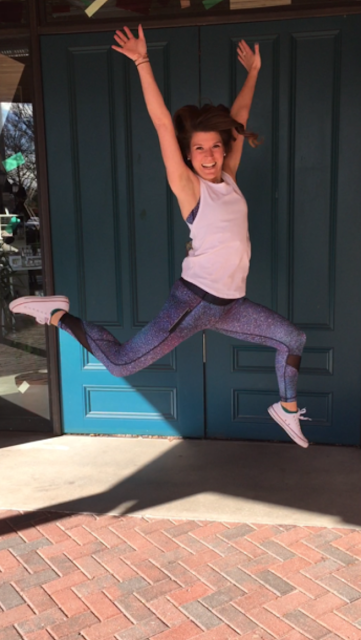
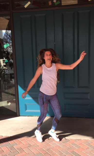
I love the print…refreshing after all the black and grey and black white prints. Kind of a milky way look to it with speckles of orange and sea mist and other colours. The colour is subtle which is nice. I think the bra will go with almost any solid colour top and bottom. But I like colour and prints that aren't too loud..this is perfect…helps that I like blue as it is based on blue.
Eww, don't like this print. Also, really hate the mesh bits on the Inspire tights… miss the original Inspires… although always wished they would do them without the little bit of contrast colour panels on the ankles(on the original ones), but the mesh is way worse and ugly looking.
I haven't seen it in person but the colors are too similar to the teeki mermaid ones I have. I do love them though, the colors are pretty for barre or reformer. I probably wouldn't be hyped about them for running. Just my preference. 🙂 I like them in the speeds cause it's no full legs of color
Yes! The first thing I thought of when I saw this print was the Teeki mermaid leggings I have.
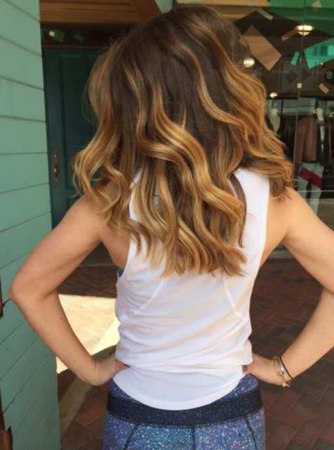
For some 2017 positivity, the model in the top pictures has beautiful hair!
Yes! I love her hair too.
I was kinda interested in the Muscle Love tank (non cropped version) since I love the Muscle Swing Tank and I think the girl in the white tank looks really good in it. I do prefer the higher armpit cut on the Muscle Swing, where I can wear it with a regular bra or wear it out without showing my bra. Anyone try the Muscle Love tank? Thoughts?
The print is so pretty! not one i would get sick of easily either. Just not crazy about the styles it comes in, so unless they release a Nulux version of HT or WUP, I won't be getting this one.
I like the print, though I need to see it in person to decide if the speed shorts will be mine. This print does remind me of a similar one from Athleta: http://athleta.gap.com/browse/product.do?cid=1023731&vid=1&pid=457280002
I like the print, hate the black stitching right up the crotch – deal killer for me!!!
Not sure how I feel about this print and feel like it might be somewhat disappointing in person.
Agree, that black stitching over the crotch is so gross, is someone in design just massively trolling…
Tried these on today and I absolutely loved the print but the black stitching was a no go for me. My 14 year old daughter said it looked like a path leading you right to my crotch. Totally gross and ruined the pants for me. Ugh!
I can't say I fixated on black stitching…I figure we are all mature at our gym to not be fixating on that…rather we are working on our bodies. I just thought black stitching may dictate pairing a black tank with it…that's all. We all have crotches so not a big deal for me…but to each their own.
The black stitching doesn't look nice with this print/colours. Absolutely nothing to do with crotch area, just doesn't look good anywhere on the pants, imo.
Yes navy or hero blue would have coordinated better
I'm sure when they get marked down everyone will forget about stitching sheerness or whatever the reason they find to dislike them…lol…that's usually how it Rolla with some of the other prints. I think the print and the addition of color is a nice change for those bored with black and grey
Haha! I totally agree with you. That's what usually happens. I remember how everybody was complaining about Mixed Marble Nulux pants being sheer , but once they got marked down they flew of the shelves. Same thing with dark stitching . I personally prefer dark stitching for my workout clothes. like somebody commented earlier everybody has crotches, grow up
Grow up, bit uncalled for. Sorry I don't like clothes that have a landing strip over my crotch. Next you'll be saying camel toes are nice
lol
and just because we all have crotches doesn't mean we all have to "highlight" them (yikes!)
I think the point was that nobody is really spending that much time looking at crotches especially in gym setting…perhaps people don't have to worry so much…I think she was trying to be reassuring. But maybe some feel they are being checked out. It isn't gross…a crotch is natural. But not everyone feels that way which is understood.
I got the print in the Fast Lane bra so that I can pair it with all my CRBs (which I cannot wear without a high coverage bra). It offers a nice pop of color but not too much to be overwhelming.
I like this print…. But I hate Inspire tights… I hope this is the good luxtreme. Maybe they'll come in pace rivals?
They have the PR in this print up now. I so badly want new PR's but i don't think I like them in this print. Boo.
Upload is up on the app.